

A dip between blue and red: VERY PERI
Pantone has revealed its Color of the Year 2022: VERY PERI.
A beautiful periwinkle shade that boasts equal parts elegance and extravagance.
For fans of fashion and home decor trends, this should come as no surprise, as shades of light blue, lilac, and lavender have all increased in popularity in the last few months of 2021.
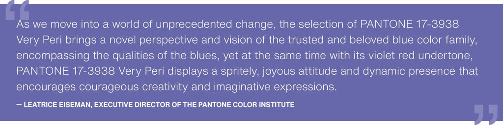
“PANTONE 17-3938 Very Peri helps us to embrace this altered landscape of possibilities, opening us up to a new vision as we rewrite our lives”, states Pantone’s website on how Very Peri speaks to the transformative times we are living in.
“Very Peri is a symbol of the global zeitgeist of the moment and the transition we are going through. As we emerge from an intense period of isolation, our notions and standards are changing, and our physical and digital lives have merged in new ways. Digital design helps us to stretch the limits of reality, opening the door to a dynamic virtual world where we can explore and create new color possibilities.” – Pantone.com
While lovers of bright colors and pastel aesthetics might have no problem introducing all kinds of periwinkle room decor to their spaces, Very Peri can understandably give neutral or minimalist home decorators a break.
Periwinkle home decor isn’t necessarily as over-the-top as you might think. Just like any other color, periwinkle can be strong, muted, bright or deep – the options are vast and the stylistic choices, all to be explored!


How to use Very Peri in your home?
Purple and blue are colors that instill calm and relaxation, so perfect for use in the bedroom.
One idea is to use a wallpaper for the wall behind the bed with the color periwinkle declined in a soft and elegant way.

The color VERY PERI can also be used to decorate the walls of the house (matte or glossy paint). We recommend not to decorate with box effect all the walls, but choose one of the walls of the room or small portions.
The effect is unusual and trendy, but may, in the long run, get tired.


The particularity of VERY PERI, can be expressed in a multifaceted way and easily used in furniture accessories: carpets, paintings, pillows, vases or small furnishings.
It will be easier to mix the color to the style of your home and give a touch of eccentricity (or elegance) to your environments.


How to match VERY PERI?
The VERY PERI is a color that dares a lot in home environments and is not suitable to be combined with many colors.
Pantone comes to our aid by proposing palettes of combinations to inspire us.

BALANCING ACT
Balancing Act is a complementary palette of colors whose natural balance of warm and cool tones allows them to support and enhance each other. The brightness of PANTONE 17-3938 Very Peri is intensified by this artfully calibrated palette, which instills a feeling of vibrancy and visual vibrancy.

WELLSPRING
A complete and harmonious combination of nature-inspired hues, Wellspring highlights the compatibility of greens with the positive nature of PANTONE 17-3938 Very Peri, as well as the life-saving properties of these subtle and refreshing tones.
THE STAR OF THE SHOW
The dynamic presence of PANTONE 17-3938 Very Peri is best expressed in The Star of the Show, in which we surround this most joyful and warm shade of blue with a palette of classic and neutral tones. Together, their elegance and subtle style send us a message of timeless sophistication.
In this palette, the parquet and marble-effect floors of Ceramica Mediterranea’s collections marry beautifully.

AMUSEMENTS
A joyful and playful color story filled with unabashed fun and spontaneity. Amusements is amplified by the carefree confidence and equally fun attitude of PANTONE 17-3938 Very Peri, a sparkling shade of blue whose playfulness encourages unbridled expression and experimentation.

Images by Pinterst
